ویدیو
Velia
رایگان
دستهبندی
- نمایش پرامپت رایگان — متن کامل پرامپت همین حالا و بدون خرید باز میشود.
- این سایت رو میخوام — همان آیتم بهصورت یک سایت آمادهٔ انتشار، طراحی و راهاندازیشده. قیمت: تومان 5.000.000
Velia
MS-TEM-496متن زیر را کامل کپی کنید و در نسخهٔ Pro ابزارهای Claude Code یا GPT Codex بچسبانید تا همان صفحه ساخته شود. بدون اشتراک Pro این ابزارها، پرامپت کامل اجرا نمیشود.
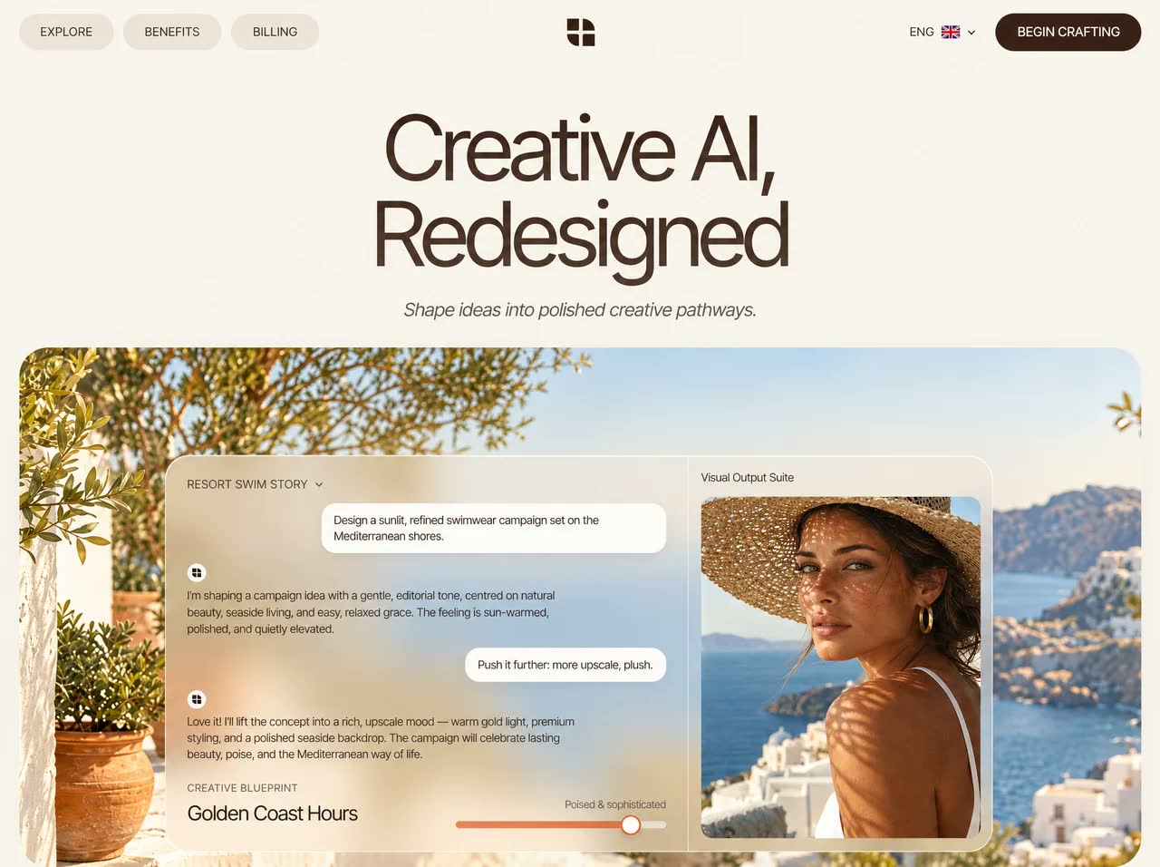
Build a single standalone index.html (all CSS and JS inline, no build step, no local assets) for a premium AI creative-direction landing page called "Velia". Recreate it exactly as specified. All images and videos load directly from the CloudFront URLs given. The page must be fully mobile responsive with smooth, premium, staggered animations. Where this prompt gives code marked VERBATIM, copy it exactly as written; do not rewrite, simplify or "improve" it.

====================================================================
1. HEAD: FONTS, LIBRARIES, TOKENS
====================================================================
<title>Velia — Creative AI, Redesigned</title>
<meta name="description" content="Shape ideas into polished creative pathways.">
<meta name="viewport" content="width=device-width, initial-scale=1">
Google Font "Inter Tight" (preconnect to fonts.googleapis.com and fonts.gstatic.com):
https://fonts.googleapis.com/css2?family=Inter+Tight:ital,wght@0,300;0,400;0,500;0,600;1,300;1,400&display=swap
Lenis smooth scroll, loaded right before the main script at the end of body:
<script src="https://cdn.jsdelivr.net/npm/lenis@1.1.13/dist/lenis.min.js"></script>

:root tokens:
--bg:#f6f0e7; --ink:#2a1a12; --ink-2:#5b4a3f; --brown:#3b2116; --pill:#ece3d7;
--line:rgba(42,26,18,.08); --glass:rgba(250,245,238,.55); --glass-b:rgba(255,255,255,.55);
--r-xl:34px; --ease:cubic-bezier(.22,1,.36,1); --ease-io:cubic-bezier(.65,0,.35,1)

Base: *{box-sizing:border-box;margin:0;padding:0}. body: background var(--bg), color var(--ink), font-family "Inter Tight",system-ui,sans-serif, weight 400, line-height 1.5, overflow-x:hidden, -webkit-font-smoothing:antialiased. img and video are display:block, max-width:100%. Links: color inherit, no underline. button and input: font inherit.
Do NOT set scroll-behavior:smooth on html (Lenis handles scrolling).
.wrap = width 100%, max-width 1440px, margin 0 auto, padding 0 24px (16px at ≤640px).
IMPORTANT: never combine aspect-ratio with min-height on a full-width block. The min-height carries over to the width through the ratio and causes horizontal overflow. Use explicit heights as specified.

LOGO MARK (nav, chat avatars, footer): <svg viewBox="0 0 40 40" fill="#2a1a12"><path d="M5 5h13v13H5zM22 22h13v13H22z"/><path d="M22 5a13 13 0 0 1 13 13H22zM18 35A13 13 0 0 1 5 22h13z"/></svg>

====================================================================
2. CLOUDFRONT ASSETS (exact URLs)
====================================================================
VIDEOS (8s, silent, looping):
HERO_VIDEO  = https://d8j0ntlcm91z4.cloudfront.net/user_38xzZboKViGWJOttwIXH07lWA1P/hf_20261022_054532_4648c53b-8840-4872-b054-016a86833f5c.mp4
BENTO_VIDEO = https://d8j0ntlcm91z4.cloudfront.net/user_38xzZboKViGWJOttwIXH07lWA1P/hf_20261022_054543_65a4e3d3-ce77-45a9-8917-60ce35999ea7.mp4
CTA_VIDEO   = https://d8j0ntlcm91z4.cloudfront.net/user_38xzZboKViGWJOttwIXH07lWA1P/hf_20261022_054543_cc94675a-b1cc-47a8-8843-c55665b0f33b.mp4

IMAGES:
HERO_BG  = https://d8j0ntlcm91z4.cloudfront.net/user_38xzZboKViGWJOttwIXH07lWA1P/hf_20261021_093821_db49f268-cd69-4ac0-b92b-e0b8a7062322.png
HAT      = https://d8j0ntlcm91z4.cloudfront.net/user_38xzZboKViGWJOttwIXH07lWA1P/hf_20261021_093819_a1b44e43-e95a-41dd-85fb-8206e2bffc83.png
BENTO_BG = https://d8j0ntlcm91z4.cloudfront.net/user_38xzZboKViGWJOttwIXH07lWA1P/hf_20261021_093819_8ee49f04-c4b4-4be9-9788-e5f7030697ce.png
SUNFACE  = https://d8j0ntlcm91z4.cloudfront.net/user_38xzZboKViGWJOttwIXH07lWA1P/hf_20261021_093820_27269365-10b0-493c-aaeb-f491968d728e.png
PRODUCT  = https://d8j0ntlcm91z4.cloudfront.net/user_38xzZboKViGWJOttwIXH07lWA1P/hf_20261021_093821_f31363e6-8c86-4044-ae68-234c89bfd631.png
PROFILE  = https://d8j0ntlcm91z4.cloudfront.net/user_38xzZboKViGWJOttwIXH07lWA1P/hf_20261021_093820_271e56c9-4dd2-4893-ac2d-2ef620eb354e.png
HAND     = https://d8j0ntlcm91z4.cloudfront.net/user_38xzZboKViGWJOttwIXH07lWA1P/hf_20261021_093819_09809dd7-6a23-494d-ba2d-1b3181a9dee0.png
CTA_BG   = https://d8j0ntlcm91z4.cloudfront.net/user_38xzZboKViGWJOttwIXH07lWA1P/hf_20261021_093820_6e4510b1-3415-4522-80ef-8d3f9cebcfa5.png

VIDEO BACKGROUND MARKUP (hero, bento and CTA containers all use this pattern):
<video class="media" id="v-hero" autoplay muted loop playsinline preload="auto" poster="HERO_BG"></video>
<img class="media kb" data-fallback="v-hero" src="HERO_BG" alt="">
(bento: id v-bento with BENTO_BG; CTA: id v-cta with CTA_BG; use preload="metadata" for those two)
The video src is set from JS (see the script). Put these as the first children of the container, then the content.

====================================================================
3. ANIMATION + HEADING CSS — VERBATIM
====================================================================
/* content is visible if JS fails; hidden states only apply once JS adds .js to <html> */
.js .rv{opacity:0;transform:translate3d(0,28px,0);filter:blur(8px)}
.rv{transition:opacity 1.1s var(--ease),transform 1.1s var(--ease),filter 1.1s var(--ease);transition-delay:calc(var(--d,0) * 90ms + var(--base,0ms))}
.js .rv-scale{transform:scale(.96) translateY(24px)}
.js .rv.in{opacity:1;transform:none;filter:none}

/* split headings: every word is .w > span */
.split .w{display:inline-block;overflow:hidden;vertical-align:top;padding:0 .02em .12em;margin:0 -.02em -.12em}
.split .w>span{display:inline-block;will-change:transform}
.js .split .w>span{transform:translateY(110%) rotate(4deg);opacity:0;transition:transform 1.2s var(--ease),opacity 1.2s var(--ease);transition-delay:calc(var(--i) * 70ms + var(--base,0ms))}
.js .split.in .w>span{transform:none;opacity:1}

/* hero headline gradient goes on EACH WORD, never on a wrapper */
.h-display{font-weight:400;font-size:clamp(48px,7.6vw,112px);line-height:.96;letter-spacing:-.045em;color:#3a2419}
.h-display .w>span{background:linear-gradient(180deg,#3a2419 0%,#6d5547 100%);-webkit-background-clip:text;background-clip:text;-webkit-text-fill-color:transparent;color:transparent}

.h2{font-weight:400;font-size:clamp(34px,4.4vw,62px);line-height:1.02;letter-spacing:-.04em;margin-top:18px;color:#2a1a12}
.h2 .lt{color:#8d7b6f;font-weight:300}
.cta h2{font-weight:400;font-size:clamp(56px,8.4vw,128px);line-height:.9;letter-spacing:-.055em;color:#2a1a12}

/* Lenis required CSS */
html.lenis,html.lenis body{height:auto}
.lenis.lenis-smooth{scroll-behavior:auto!important}
.lenis.lenis-stopped{overflow:hidden}

.media{position:absolute;inset:0;width:100%;height:100%;object-fit:cover}
.media.kb{animation:kb 26s var(--ease-io) infinite alternate}
@keyframes kb{from{transform:scale(1.04)}to{transform:scale(1.12) translate3d(-1.5%,-1%,0)}}

/* typed AI replies sit on top of an invisible full-length copy, so the card never changes height while typing */
.ai-t{display:grid}
.ai-t>span{grid-area:1/1}
.ai-t .ghost{visibility:hidden}

@media (prefers-reduced-motion:reduce){
  *,*::before,*::after{animation:none!important;transition-duration:.01ms!important;transition-delay:0ms!important}
  .js .rv,.js .split .w>span,.msg,.row{opacity:1!important;transform:none!important;filter:none!important}
}

Stagger rule: siblings get style="--d:1", "--d:2", … ; above-the-fold items get a fixed delay with style="--base:700ms".

HEADING MARKUP (use exactly; the script splits the words at runtime):
Hero:    <h1 class="h-display split" data-split style="--base:150ms">Creative AI,<br>Redesigned</h1>
Bento:   <h2 class="h2 split" data-split>Concepts Get Sharper with<br><span class="lt">A Guiding Direction</span></h2>
Prod:    <h2 class="h2 split" data-split>From Creative Blueprint to<br><span class="lt">Polished Imagery</span></h2>
CTA:     <h2 class="split" data-split>Craft<br>Ideas</h2>

====================================================================
4. NAV (fixed)
====================================================================
<header class="nav" id="nav">: position fixed, inset 0 0 auto 0, z-index 50, padding 16px 0, transition background/padding/box-shadow .5s var(--ease). .nav.scrolled = background rgba(246,240,231,.72), backdrop-filter blur(18px) saturate(140%) (add -webkit- too), padding 10px 0, box-shadow 0 1px 0 var(--line).
Inner .wrap: display grid, grid-template-columns 1fr auto 1fr, align-items center.
- Left .nav-l (flex, gap 10px): pill links "Explore" (#product), "Benefits" (#features), "Billing" (#pricing). .pill = background var(--pill), radius 999px, padding 10px 24px, 13px, uppercase, letter-spacing .04em; hover background #e3d6c6 and translateY(-1px).
- Centre: <a class="logo"> 44×44 grid-centred with a 40×40 logo mark that rotates 90deg on hover (.8s var(--ease)).
- Right .nav-r (flex, justify-end, gap 22px): .lang = "ENG" 13px + a UK flag SVG 20×14 (radius 2px) + a 9×6 chevron; then <a class="btn-dark" href="#start">Begin Crafting</a>; then <button class="burger" id="burger">, which is hidden on desktop.
.btn-dark = background var(--brown), color #f6ede2, radius 999px, padding 11px 26px, 13px, uppercase, letter-spacing .05em, border 0, cursor pointer, position relative, overflow hidden, isolation isolate. Its ::before is a sheen: linear-gradient(120deg, transparent 30%, rgba(255,255,255,.22) 50%, transparent 70%) at translateX(-120%), z-index -1, moving to translateX(120%) on hover (.9s var(--ease)). Hover also applies translateY(-2px) and box-shadow 0 12px 28px -12px rgba(59,33,22,.6).
.burger = 42px circle, var(--pill), border 0, flex column centred, gap 5px, containing two <i> lines 16×1.5px in var(--ink). body.menu-open turns them into an X: first line translateY(3.25px) rotate(45deg), last line translateY(-3.25px) rotate(-45deg).
.mmenu (#mmenu): fixed inset 0, z-index 40, rgba(246,240,231,.96) with blur 20px, flex column centred, gap 18px, opacity 0 and pointer-events none, transition .5s. Its links are 34px with letter-spacing -.03em, starting at opacity 0 and translateY(16px). body.menu-open shows the menu, and the links animate in with delays 0, .06s, .12s, .18s. Links: "Explore", "Benefits", "Billing", "Begin crafting".

====================================================================
5. SECTION 1 — HERO (<section class="hero" id="product">)
====================================================================
Padding-top 118px. .hero-head: centred text, padding 0 16px. It contains the hero H1 (markup above), then
<p class="hero-sub rv" style="--base:700ms">Shape ideas into polished creative pathways.</p>
(italic, clamp(16px,1.5vw,20px), var(--ink-2), margin-top 22px).

.hero-card (class "hero-card rv rv-scale", style --base:850ms): position relative, margin-top 34px, radius 34px, overflow hidden, height clamp(680px, 45.5vw, 860px) (NO aspect-ratio, NO min-height), background #e8dccb, box-shadow 0 40px 80px -50px rgba(59,33,22,.45). Children: the video pattern (HERO_VIDEO / HERO_BG), then <div class="shade"> (absolute, inset 0, radial-gradient(60% 70% at 50% 55%, rgba(246,240,231,.18), transparent 70%)), then the studio panel.

#studio.studio: absolute at left 50% / top 50%, translate(-50%,-50%), width min(920px,74%), grid-template-columns 1.7fr 1fr, radius 26px, background rgba(240,232,222,.42), backdrop-filter blur(26px) saturate(130%), border 1px solid rgba(255,255,255,.55), box-shadow 0 30px 60px -30px rgba(40,20,10,.35) plus inset 0 1px 0 rgba(255,255,255,.6), overflow hidden.

LEFT .chat (padding 22px 24px, flex column, gap 12px). Every child has class "msg":
 1. .chat-top: "Resort Swim Story" + a 10px chevron. 12px uppercase, letter-spacing .08em, #4b3a30.
 2. .bubble: "Design a sunlit, refined swimwear campaign set on the Mediterranean shores."
 3. .ai: <div class="ai-ic"> (a 20px off-white circle rgba(255,253,249,.92) holding a 12px logo mark) + <div class="ai-t" data-text="I'm shaping a campaign idea with a gentle, editorial tone, centred on natural beauty, seaside living, and easy, relaxed grace. The feeling is sun-warmed, polished, and quietly elevated."></div>
 4. .bubble: "Push it further: more upscale, plush."
 5. .ai with data-text="Love it! I'll lift the concept into a rich, upscale mood — warm gold light, premium styling, and a polished seaside backdrop. The campaign will celebrate lasting beauty, poise, and the Mediterranean way of life."
 6. .cd (margin-top auto, flex, space-between, align-items flex-end, gap 20px, padding-top 6px): left = <small>CREATIVE BLUEPRINT</small> (block, 11px uppercase, letter-spacing .08em, #6a594d) + <strong>Golden Coast Hours</strong> (block, weight 400, clamp(18px,1.7vw,24px), letter-spacing -.02em, margin-top 2px). Right = .slider (width 44%, min-width 120px, text-align right): <small>Poised & sophisticated</small> (11.5px, no uppercase) + .track (relative, 8px tall, radius 99px, rgba(255,255,255,.55), margin-top 8px) containing <b id="hero-track"> (absolute, left 0, top/bottom 0, width 0, radius 99px, gradient 90deg #e2875c→#d4612f, transition width 1.8s var(--ease)). The b::after is an 18px white circle with a 2px #d4612f border and box-shadow 0 4px 10px rgba(0,0,0,.15), vertically centred at right:-9px.
.bubble = align-self flex-end, max-width 72%, background rgba(255,253,249,.9), radius 16px, padding 10px 14px, 12.5px, line-height 1.4, #3b2a20, box-shadow 0 6px 18px -10px rgba(40,20,10,.25).
.ai = flex column, gap 6px, max-width 82%, 12.5px, line-height 1.5, #3d2e25.
.msg = opacity 0, translateY(12px) scale(.98), transition .8s var(--ease). .msg.show = opacity 1, transform none.
Typing dots: <span class="typing"><i></i><i></i><i></i></span>; .typing = inline-flex, gap 4px, padding 6px 0, align-self start; each i is a 5px circle #7a675b with animation dot 1.2s infinite ease-in-out (delays 0, .15s, .3s); @keyframes dot {0%,80%,100%{opacity:.25;transform:none} 40%{opacity:1;transform:translateY(-3px)}}.

RIGHT .prod (padding 14px, border-left 1px solid rgba(255,255,255,.45), flex column, gap 10px):
 <span class="msg">Visual Output Suite</span> (12.5px, #4b3a30)
 <figure id="hero-fig" class="msg"><img src="HAT" alt="A woman in a woven hat under dappled sun"></figure>
 figure: relative, flex 1, radius 14px, overflow hidden, min-height 240px. Its img is absolute, inset 0, cover, starting at scale(1.15) with transition transform 2.4s var(--ease); figure.in img goes to scale(1). figure::after is a sheen: linear-gradient(110deg, transparent 40%, rgba(255,255,255,.45) 50%, transparent 60%) at translateX(-100%), animated to translateX(100%) over 1.6s var(--ease), starting at 1.4s (forwards).
The two columns animate as independent, simultaneous sequences (see the script).

====================================================================
6. SECTION 2 — BENTO (<section class="s-bento" id="features">)
====================================================================
Padding-top 120px. .bento-shell: relative, radius 34px, overflow hidden, padding 72px 40px 40px, isolation isolate. Video pattern (BENTO_VIDEO / BENTO_BG) with .media at z-index -2. ::before overlay at z-index -1: linear-gradient(180deg, rgba(220,234,248,.55) 0%, rgba(246,240,231,.05) 40%, rgba(246,240,231,.15) 100%).
Centred .sec-head:
 <span class="eyebrow rv">From insights to imagery</span>: inline-block, 10.5px uppercase, letter-spacing .14em, background rgba(255,255,255,.65), border 1px solid rgba(255,255,255,.8), padding 6px 12px, radius 999px, blur 8px, color var(--ink-2).
 Then the bento H2 (markup above).
 <p class="lead rv" style="--d:3">Go beyond single-use prompts. Velia unites your brief, brand, and inspiration to shape creative direction with meaning.</p> (max-width 440px, margin 16px auto 0, 14px, var(--ink-2), line-height 1.55)
.bento grid: margin-top 48px, columns 1.25fr 1fr 1fr, gap 14px.
.card: relative, radius 24px, overflow hidden, background var(--glass), backdrop-filter blur(22px) saturate(130%), border 1px solid var(--glass-b), box-shadow inset 0 1px 0 rgba(255,255,255,.6) plus 0 20px 40px -30px rgba(40,30,20,.35), transition transform and box-shadow .7s var(--ease). Hover: translateY(-6px) and 0 30px 60px -30px rgba(40,30,20,.45). Card h4: 16px weight 400. Card p: 12px, line-height 1.5, #5b4a3f, margin-top 6px.
.c-pad = padding 14px, flex column, min-height 272px; .txt = padding 14px 6px 4px.
Cards, in order (each with class rv and --d:1…5):
 1. .card.c-big: grid-row span 2, min-height 560px, padding 28px, color #fff, flex column space-between, background transparent, border-color rgba(255,255,255,.35). Its first child is <img src="SUNFACE"> (absolute cover, z-index -2, scale 1.05 on card hover over 1.6s). ::before at z-index -1: linear-gradient(180deg, rgba(48,30,20,.62) 0%, rgba(48,30,20,.25) 28%, rgba(60,40,28,0) 45%, rgba(60,40,28,.05) 60%, rgba(40,25,15,.55) 100%).
    Top: <h3>Learn just what<br><span>sets you apart.</span></h3> (clamp(28px,2.6vw,38px), weight 400, line-height 1.05, letter-spacing -.035em; the inner span at opacity .72) + <p class="desc">Velia studies your voice, inspiration and audience so each direction feels distinctly like your brand.</p> (12.5px, opacity .85, max-width 300px, margin-top 12px).
    Bottom: .avatars (flex, align center, gap 10px, 11.5px) = three overlapping 30px circles (PROFILE, HAT, SUNFACE; 2px white border; margin-left -8px except the first) + "Loved by 2,400+ creative studios". Then <a class="btn-white">Try Velia now</a> (block, centred text, white background, #2a1a12 text, radius 999px, padding 12px, 13px, margin-top 14px, hover translateY(-2px)).
 2. .c-pad: .collage (flex 1, 2-column grid, gap 6px, min-height 140px, radius 16px, overflow hidden) with PRODUCT and PROFILE images (width/height 100%, cover, radius 12px, scale 1.05 on card hover). .txt: h4 "Catch the Pulse"; p "Velia draws the heart out of your brief — voice, audience and goals — to ground each new direction."
 3. .c-pad#gauge-card: .gauge (relative, flex 1, grid centred, min-height 150px) containing <svg viewBox="0 0 180 100" style="width:180px;height:110px;overflow:visible">. Track path d="M10 95 A80 80 0 0 1 170 95", stroke rgba(42,26,18,.1), width 12, round caps. Arc path id="g-arc" with the same d, stroke url(#gg), width 12, round caps, stroke-dasharray 252, stroke-dashoffset 252, style transition stroke-dashoffset 2.2s cubic-bezier(.22,1,.36,1). linearGradient #gg (x1 0, x2 1) runs #a9c6e6→#e9a77d. Value .val (absolute, top/left 50%, translate(-50%,-20%), 30px, letter-spacing -.03em) = <span data-count="94">0</span>%. .ends row (absolute bottom 6px, left/right 12px, space-between, 10px #7a6a5e): "Average" / "Distinct". .txt: h4 "Designed for Your Brand"; p "Each idea gets measured against your guidelines, so nothing strays off-brand."
 4. .c-pad: .rows (flex 1, column, gap 6px, padding 6px) with three .row elements (style --i:0/1/2). Each row: flex, align center, gap 10px, background rgba(255,255,255,.62), radius 12px, padding 8px, 11.5px; a 34px image with radius 8px; <b> title (12px, weight 500, block) + <em> subtitle (normal style, 10.5px #8a7a6e); .ok = an 18px #2a1a12 circle on the right (margin-left auto) with a 9px white check SVG. Rows start at opacity 0, translateX(-14px), transition .8s var(--ease), delay calc(var(--i)*140ms + 400ms); .in .row goes to opacity 1, transform none.
    Rows: HAT "Lead Visual" / "Soft · Organic · Rich"; PRODUCT "Product Still" / "Warm glow · Marble"; PROFILE "Story Crop" / "Profile · Late sunset".
    .txt: h4 "Coherent Through Every Element"; p "A single direction flows through campaign, product and social — always in sync."
 5. .c-pad: .insight (relative, flex 1, radius 16px, overflow hidden, min-height 150px) with the HAT image (absolute cover, object-position 50% 25%, scale 1.06 on hover) and a .chip (absolute top/right 10px, rgba(255,255,255,.82), blur 10px, radius 12px, padding 8px 10px, 10.5px, flex gap 8px, shadow 0 8px 20px -10px rgba(0,0,0,.3), animation float 6s ease-in-out infinite going translateY 0→-6px→0) holding an 8px #7fb07a dot with box-shadow 0 0 0 4px rgba(127,176,122,.2) and the text "Voice synced". .txt: h4 "Bring Vision into Motion"; p "Velia converts direction into shoot-ready briefs, shot sheets and final imagery."

====================================================================
7. SECTION 3 — PRODUCTION (<section class="s-prod" id="pricing">)
====================================================================
Padding-top 120px. .prod-shell: relative, radius 34px, overflow hidden, padding 72px 40px 0, background linear-gradient(180deg, #f3ead8 0%, #efe7da 30%, #dfe8f1 70%, #c9dcef 100%). ::before: a 700px circle, left 50% with translateX(-50%), top 40%, radial-gradient(circle, rgba(255,241,214,.9), transparent 65%), blur 10px, pointer-events none.
.sec-head (position relative): eyebrow "Smart image production"; the production H2 (markup above); lead (--d:3) "Velia turns your creative direction into polished visuals, alternative takes and launch-ready assets."
.stage#stage: relative, margin-top 30px, grid 1fr 1.05fr 1fr, align-items end, gap 20px. Side .col = flex column, gap 14px, padding-bottom 48px.
.g-card: background rgba(255,255,255,.62), blur 20px, border 1px solid rgba(255,255,255,.85), radius 20px, padding 16px, box-shadow 0 20px 40px -30px rgba(40,30,20,.35), transition .6s; hover translateY(-4px). .lbl = 10px uppercase, letter-spacing .12em, #8a7a6e. h5 = 17px weight 400, letter-spacing -.01em. em = normal style, 11.5px #8a7a6e.
LEFT column:
 a. .g-card.rv --d:1: lbl "Create alternatives"; .thumbs (3-column grid, gap 6px, margin-top 12px) of aspect-ratio 1 images (width 100%, cover, radius 10px): SUNFACE, PRODUCT, PROFILE. .g-foot (flex space-between, align center, margin-top 12px, 12px #5b4a3f): "12 distinct alternates" + a 22px #f2c94c circle with a right-arrow SVG in #3b2116.
 b. .g-card.build.rv --d:2: lbl "Now rendering"; h5 "Composing Your Image" (margin-top 4px); ul (no bullets, margin-top 12px, column, gap 9px) rows (flex space-between, 12px; label in #5b4a3f with a 13px outline icon, gap 8px; value in #2a1a12): "Genre" — "Organic editorial", "Exposure" — "Warm sunlight", "Arrangement" — "Product-centred". .bar (margin-top 14px, flex, align center, gap 10px, 11px #8a7a6e): .t track (flex 1, 6px tall, rgba(42,26,18,.08), radius 99px, overflow hidden) containing b (block, height 100%, gradient #f2c94c→#e9a26a, width 0, transition width 2.4s var(--ease) .5s; .in .bar .t b goes to width 72%), then "Developing…".
CENTRE .hand.rv --d:2: relative, align-self end, height 640px, radius 24px 24px 0 0, overflow hidden, mask-image and -webkit-mask-image linear-gradient(180deg, transparent 0%, #000 14%, #000 100%). Inside: <img id="hand-img" src="HAND" alt="A hand raising a beige skincare tube toward pale sky"> at absolute left 0 / top 0, width 100%, height 115%, object-fit cover, will-change transform. The parallax is driven by the script.
RIGHT column:
 a. .g-card.rv --d:3: lbl "Set for launch"; .hero-vis (flex, gap 12px, margin-top 12px) = an 84×104 PRODUCT image (radius 12px, flex none, cover) + h5 "Lead Visual" + em "Sunlit Glow Edit" + ul.checks (no bullets, margin-top 8px, column, gap 5px, 11.5px #5b4a3f; each li has a 12px #f2c94c dot, gap 7px): "Visual rendered", "On-brand look", "Launch-ready". Then <a class="view">See results →</a> (flex space-between, align center, border-top 1px var(--line), margin-top 14px, padding-top 12px, 12.5px; the 14px arrow moves translateX(4px) on hover).
 b. .g-card.rv --d:4 #match-card: lbl "Creative blueprint"; h5 "Sunlit Glow Edit" + em "Soft · Organic · Radiant" (margin-top 8px block); .match-row (flex, gap 10px, align center, margin-top 12px) = .ring (relative, 62×62, flex none) holding <svg viewBox="0 0 62 62" style="transform:rotate(-90deg);width:100%;height:100%"> with a track circle (cx 31, cy 31, r 26, fill none, stroke rgba(42,26,18,.08), width 6) and circle#ring-arc (same geometry, stroke #f2c94c, width 6, round cap, dasharray 163.4, dashoffset 163.4, transition stroke-dashoffset 2s cubic-bezier(.22,1,.36,1) .3s). Over it, a label span (absolute inset 0, display flex, align and justify centre, 13px, white-space nowrap) = <b data-count="94" style="font-weight:400">0</b>%. Next to the ring, the SUNFACE image (width 100%, height 96px, cover, radius 12px).

====================================================================
8. SECTION 4 — CTA + FOOTER (<section class="s-foot" id="start">)
====================================================================
Padding-top 120px. .cta.rv.rv-scale: relative, radius 34px, overflow hidden, min-height 440px, padding 56px, flex column, justify-content flex-end, isolation isolate. Video pattern (CTA_VIDEO / CTA_BG) at z-index -2. ::before at z-index -1: linear-gradient(90deg, rgba(246,240,231,.78) 0%, rgba(246,240,231,.35) 38%, transparent 65%).
 The CTA H2 (markup above).
 <p class="rv" style="--d:2">Share your concepts and inspiration with Velia, and shape them into a creative path that's set to perform.</p> (max-width 340px, margin-top 20px, 14px, #3d2e25)
 <form class="sub rv" style="--d:3"> (margin-top 22px, flex, align center, gap 6px, max-width 420px, background rgba(255,255,255,.7), blur 16px, border 1px solid rgba(255,255,255,.9), radius 999px, padding 6px 6px 6px 20px; :focus-within adds box-shadow 0 0 0 4px rgba(59,33,22,.08)): <input type="email" required aria-label="Email address" placeholder="Drop your email to begin"> (flex 1, min-width 0, no border, transparent, no outline, 13.5px, placeholder #8a7a6e) + <button class="btn-dark" type="submit">Begin Crafting</button>. On submit: preventDefault and set the button text to "Signed up ✓".
<footer class="foot"> (padding 72px 0 28px): .foot-grid = grid 1.6fr repeat(3,1fr) auto, gap 32px. Each column is .rv with --d 0–4.
 - .about: h6 "About" (13px, weight 500, margin-bottom 16px); p "Velia helps creative studios mold ideas and intent into bold creative direction." (13px #6a594d, max-width 280px); .socials (flex, gap 10px, margin-top 24px) = four 36px var(--pill) circles with 14px Facebook, X, YouTube and Instagram icons (hover background #e3d6c6 and translateY(-3px)).
 - h6 "Product": The Workflow · Creative Insight Labs · Image Making Studio · Campaign Results
 - h6 "Resources": Q&A · Mood Boards · Craft Playbooks · Support
 - h6 "Company": About Velia · Join Us · Privacy · Terms
   Link lists: no bullets, flex column, gap 10px; links 13px #6a594d, relative; ::after is a 1px underline at bottom -2px using scaleX(0) with transform-origin right; on hover the color goes to #2a1a12 and the underline scales to 1 with transform-origin left (.5s var(--ease)).
 - .mark: the 40px logo mark.
 .legal (flex space-between, gap 16px, margin-top 64px, padding-top 22px, border-top 1px var(--line), 12px #8a7a6e): "Privacy notice" | "© Copyright Velia 2026" | "Usage policy".

====================================================================
9. SCRIPT — VERBATIM (one <script> at the end of body, after the Lenis script)
====================================================================
document.documentElement.classList.add('js');

const VIDEOS = {
  "v-hero":  "https://d8j0ntlcm91z4.cloudfront.net/user_38xzZboKViGWJOttwIXH07lWA1P/hf_20261022_054532_4648c53b-8840-4872-b054-016a86833f5c.mp4",
  "v-bento": "https://d8j0ntlcm91z4.cloudfront.net/user_38xzZboKViGWJOttwIXH07lWA1P/hf_20261022_054543_65a4e3d3-ce77-45a9-8917-60ce35999ea7.mp4",
  "v-cta":   "https://d8j0ntlcm91z4.cloudfront.net/user_38xzZboKViGWJOttwIXH07lWA1P/hf_20261022_054543_cc94675a-b1cc-47a8-8843-c55665b0f33b.mp4"
};

(() => {
  const reduce = matchMedia('(prefers-reduced-motion: reduce)').matches;
  const wait = ms => new Promise(r => setTimeout(r, ms));

  // 1) background videos: fade the still out once the video actually plays
  Object.entries(VIDEOS).forEach(([id, url]) => {
    const v = document.getElementById(id);
    const still = document.querySelector('[data-fallback="' + id + '"]');
    if (!v) return;
    v.src = url;
    v.addEventListener('playing', () => {
      if (still) { still.style.transition = 'opacity 1.2s'; still.style.opacity = 0; }
    }, { once: true });
    v.play().catch(() => {});
  });

  // 2) split headings into words, keeping nested spans and <br>
  document.querySelectorAll('[data-split]').forEach(el => {
    let i = 0;
    const walk = node => {
      [...node.childNodes].forEach(n => {
        if (n.nodeType === 3) {
          const frag = document.createDocumentFragment();
          n.textContent.split(/(\s+)/).forEach(part => {
            if (!part) return;
            if (/^\s+$/.test(part)) { frag.appendChild(document.createTextNode(' ')); return; }
            const w = document.createElement('span'); w.className = 'w';
            const s = document.createElement('span'); s.textContent = part; s.style.setProperty('--i', i++);
            w.appendChild(s); frag.appendChild(w);
          });
          n.replaceWith(frag);
        } else if (n.nodeType === 1 && n.tagName !== 'BR') walk(n);
      });
    };
    walk(el);
  });

  // 3) count-up
  const countUp = el => {
    const end = +el.dataset.count, t0 = performance.now(), dur = reduce ? 1 : 2000;
    const tick = t => {
      const p = Math.min(1, (t - t0) / dur);
      el.textContent = Math.round(end * (1 - Math.pow(1 - p, 4)));
      if (p < 1) requestAnimationFrame(tick);
    };
    requestAnimationFrame(tick);
  };

  // 4) reveal on scroll (low threshold so tall blocks, like the stacked hero card on phones, still trigger)
  const reveal = el => {
    if (el.classList.contains('in')) return;
    el.classList.add('in');
    el.querySelectorAll('[data-count]').forEach(countUp);
    if (el.id === 'gauge-card') document.getElementById('g-arc').style.strokeDashoffset = 252 * (1 - .94);
    if (el.id === 'match-card') document.getElementById('ring-arc').style.strokeDashoffset = 163.4 * (1 - .94);
  };
  const targets = document.querySelectorAll('.rv,[data-split]');
  const io = new IntersectionObserver(entries => entries.forEach(e => {
    if (e.isIntersecting) { reveal(e.target); io.unobserve(e.target); }
  }), { threshold: 0.08, rootMargin: '0px 0px -6% 0px' });
  targets.forEach(el => io.observe(el));
  // safety net: reveal anything already on screen even if the observer is late
  const sweep = () => targets.forEach(el => {
    const r = el.getBoundingClientRect();
    if (r.top < innerHeight * 0.94 && r.bottom > 0) reveal(el);
  });
  requestAnimationFrame(() => requestAnimationFrame(sweep));
  addEventListener('load', sweep);

  // 5) hero card: reserve each reply's final height, then run two independent sequences that start together
  document.querySelectorAll('#studio .ai-t').forEach(el => {
    el.innerHTML = '<span class="ghost"></span><span class="live"></span>';
    el.firstChild.textContent = el.dataset.text;
  });
  const typeInto = (el, text, speed = 14) => new Promise(res => {
    const live = el.querySelector('.live');
    if (reduce) { live.textContent = text; return res(); }
    live.innerHTML = '<span class="typing"><i></i><i></i><i></i></span>';
    setTimeout(() => {
      live.textContent = ''; let k = 0;
      const step = () => { k += 2; live.textContent = text.slice(0, k); k < text.length ? setTimeout(step, speed) : res(); };
      step();
    }, 650);
  });
  const runColumn = async (items, done) => {
    await wait(reduce ? 0 : 1500);
    for (const m of items) {
      m.classList.add('show');
      if (m.id === 'hero-fig') m.classList.add('in');
      const t = m.querySelector('.ai-t');
      if (t) await typeInto(t, t.dataset.text);
      else await wait(reduce ? 0 : 380);
    }
    if (done) done();
  };
  runColumn([...document.querySelectorAll('#studio .chat .msg')], () => {
    document.getElementById('hero-track').style.width = '84%';
  });
  runColumn([...document.querySelectorAll('#studio .prod .msg')]);

  // 6) smooth scroll + one scroll handler for nav state and hand parallax
  const nav = document.getElementById('nav');
  const hand = document.getElementById('hand-img');
  const stage = document.getElementById('stage');
  const onScroll = () => {
    nav.classList.toggle('scrolled', scrollY > 20);
    if (!reduce && hand && stage) {
      const r = stage.getBoundingClientRect();
      const p = Math.min(1, Math.max(0, (innerHeight - r.top) / (innerHeight + r.height)));
      hand.style.transform = 'translate3d(0,' + (-p * 12).toFixed(2) + '%,0)';
    }
  };
  let lenis = null;
  if (!reduce && window.Lenis) {
    lenis = new Lenis({ duration: 1.25, easing: t => Math.min(1, 1.001 - Math.pow(2, -10 * t)), smoothWheel: true });
    lenis.on('scroll', onScroll);
    const raf = t => { lenis.raf(t); requestAnimationFrame(raf); };
    requestAnimationFrame(raf);
  } else {
    let ticking = false;
    addEventListener('scroll', () => {
      if (!ticking) { requestAnimationFrame(() => { onScroll(); ticking = false; }); ticking = true; }
    }, { passive: true });
  }
  onScroll();

  // 7) anchor links + mobile menu
  document.querySelectorAll('a[href^="#"]').forEach(a => a.addEventListener('click', e => {
    const id = a.getAttribute('href');
    document.body.classList.remove('menu-open');
    if (id.length < 2) return;
    const target = document.querySelector(id);
    if (!target) return;
    e.preventDefault();
    if (lenis) lenis.scrollTo(target, { offset: -70 });
    else target.scrollIntoView({ behavior: 'smooth' });
  }));
  document.getElementById('burger').addEventListener('click', () => document.body.classList.toggle('menu-open'));
})();

====================================================================
10. RESPONSIVE BREAKPOINTS
====================================================================
@media (max-width:1100px): .studio width 90%; .hero-card height 720px. .bento columns 1fr 1fr; .c-big becomes grid-row auto, grid-column span 2, min-height 480px. .stage columns 1fr 1fr; .hand becomes grid-column span 2, order -1, height 520px, max-width 520px, width 100%, justify-self center. .stage .col padding-bottom 0, and the last .col padding-bottom 40px. .foot-grid becomes 3 columns, with .about spanning 3.
@media (max-width:860px): hide .nav-l and .lang; .burger becomes display flex. Nav grid becomes auto 1fr auto with the logo at order -1, and .nav-r gap 10px. .hero-card: height auto, padding 120px 14px 14px. .studio: position relative, left/top auto, transform none, width 100%, one column. .prod: border-left 0, border-top 1px solid rgba(255,255,255,.45), padding 14px. #hero-fig: flex none, min-height 0, aspect-ratio 16/10; its img object-position 50% 30%.
@media (max-width:640px): .wrap padding 0 16px. .btn-dark padding 10px 18px, 12px. .hero padding-top 96px. .hero-card radius 24px, padding 72px 10px 10px. .studio radius 20px. .chat padding 18px 16px, gap 10px. .bubble and .ai max-width 92%, font-size 12px. .cd strong font-size 20px. .prod padding 12px 16px 16px. #hero-fig aspect-ratio 4/3. .cd becomes a column aligned to the start; .slider width 100%, text-align left. .s-bento, .s-prod and .s-foot padding-top 80px. .bento-shell and .prod-shell padding 48px 14px 14px, radius 24px (.prod-shell padding-bottom 0). .bento one column; .c-big grid-column auto, min-height 440px, padding 22px. .stage one column; .hand grid-column auto, height 420px. .cta padding 28px 20px, min-height 460px, radius 24px, with ::before changed to linear-gradient(180deg, rgba(246,240,231,.1) 0%, rgba(246,240,231,.55) 45%, rgba(246,240,231,.85) 100%). .foot-grid becomes 2 columns, .about spans 2, .mark is hidden. .legal becomes a centred column, gap 6px, margin-top 40px.
At every width from 320px to 2560px, document.documentElement.scrollWidth must not exceed the viewport width (no horizontal scroll), and the hero card must stay fully inside .wrap.

====================================================================
11. ACCEPTANCE CHECKS (the result must pass all of these)
====================================================================
- On load, the hero headline "Creative AI, Redesigned" animates in word by word (rising from below its line mask) and is clearly visible, with the brown vertical gradient on every word. No word is clipped or invisible.
- At 1280px, 1440px and 1920px the hero card's right edge stays inside the window, and the glass studio panel stays fully inside the card.
- The hero card keeps exactly the same height from page load until the typing finishes, at every width.
- On phones the hero card stacks: chat on top, then "Visual Output Suite" with a 4:3 portrait. Text stays readable and there is no sideways scroll.
- Every section heading and card reveals once while scrolling, staggered; nothing stays permanently invisible.
- Scrolling feels smooth (Lenis), the nav turns frosted after 20px, and the hand image drifts up gently as the production section passes.
- The gauge and ring count up to 94% and their arcs draw in when scrolled into view.
- The two hero card columns start animating at the same moment, independently.
- All 3 videos autoplay muted on loop and replace their still images.
- Exactly 4 sections after the nav: Hero, Bento, Production, CTA + Footer.شرایط و تحویل
دانلوددسترسی فوری پس از پرداخت
مالکیتاستفادهٔ تجاری مادامالعمر
آپدیتبهروزرسانیهای کتابخانه رایگان
پشتیبانیراهنمای نصب و پاسخ به سؤالات
امتیاز و نظرها
0.0/5
0 نظر ثبتشده
نظرتان را بنویسید
تجربهتان از این آیتم را با دیگر مشتریان به اشتراک بگذارید.